
Revitalizing User Experience: Redesigning Lotlinx's Retail Automotive Data Platform
The Problem
Lotlinx, a prominent retail automotive data platform, approached us with a critical challenge: their existing application was outdated, cluttered, and struggling to meet the evolving needs of users. The platform provided automotive retailers with insights and data to optimize their marketing efforts, but its cumbersome user experience hindered efficient data analysis and decision-making.
The Team
-
Senior Director of Product
(Project Leader)
-
Design Lead
(myself)
-
Senior Product Designer
-
Product Designer
Context
Goals
Enhance the user experience by streamlining the application's interface
Improve the discoverability of key features
Optimize the overall usability
Create a modern and intuitive design
Empower users to quickly analyze automotive data and make informed marketing decisions
Metrics
Decrease in user frustration and support requests related to application usage.
Increase in the average time users spent on the platform.
Reduction in the bounce rate, indicating improved engagement.
Positive feedback from users during usability testing and stakeholder feedback sessions.
Constraints
The redesign needed to be implemented within a tight timeline.
The new design should not require significant changes to the existing backend infrastructure.
The budget was limited for major overhauls, requiring careful consideration of prioritization.
Research
-
App Review
Conducted a comprehensive review of the existing application's interface, identifying pain points and areas of confusion.

-
Usage Analytics
Analyzed usage analytics to understand which features were most and least used by users.

-
Stakeholder Interviews
Held stakeholder interviews to gather insights on business goals and user needs.
-
Competitive Analysis
Studied competitors' applications to identify design patterns that resonated well with the target audience.

Insights
Poor Information Architecture
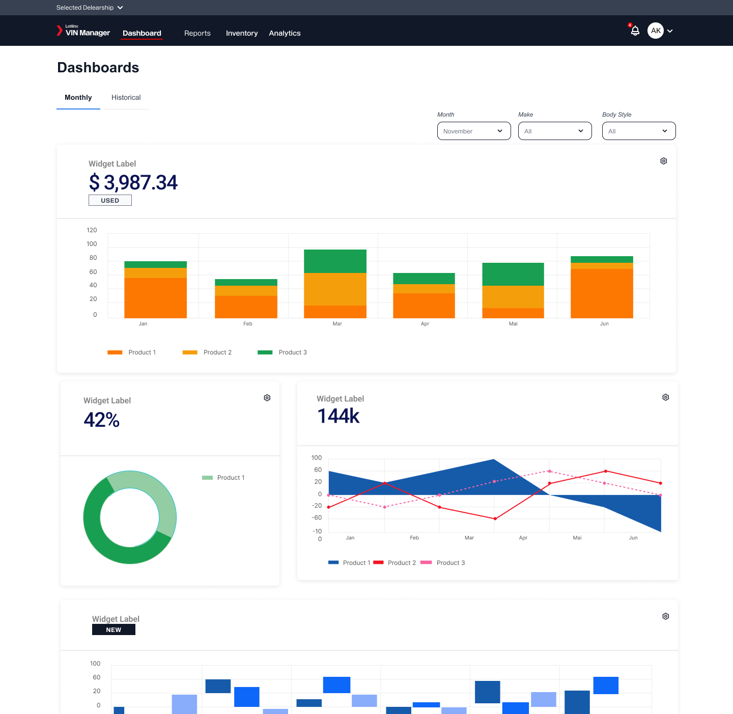
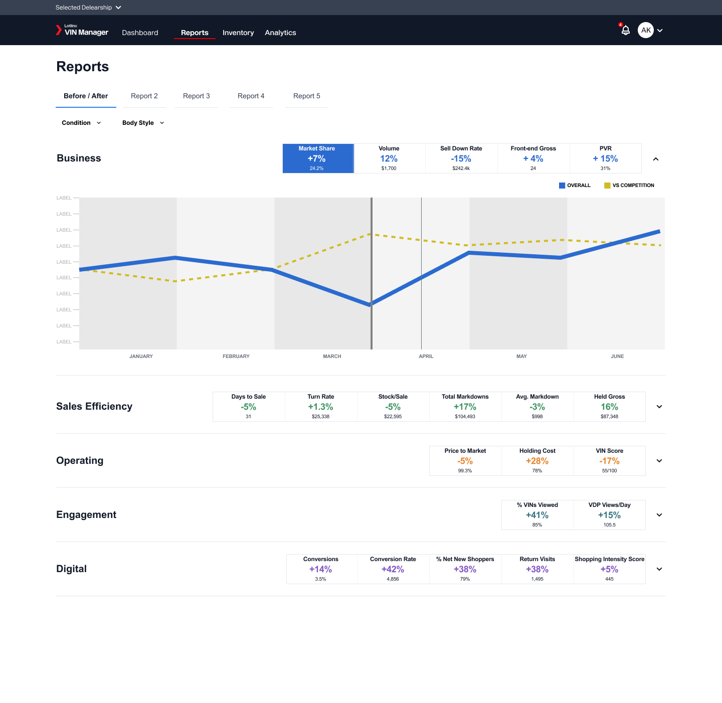
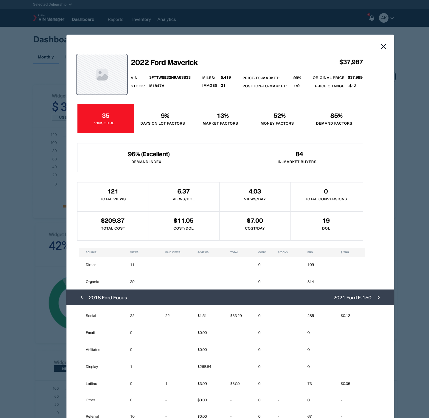
Users struggled with finding and utilizing advanced features due to poor information architecture and cluttered UI. Both the taxonomy of the application as well as content/feature categorization needed addressed.
Users desired a more visually appealing and modern design
One of the key insights we uncovered was the users' strong desire for a more visually appealing and modern design that aligned with their evolving expectations. The existing application, burdened by an outdated visual style, failed to resonate with users who were accustomed to the polished interfaces of contemporary software applications. This misalignment between design and user expectations had several noteworthy implications
Feature Bloat is Contributing to Cognitive Load
With an excessive number of options to choose from, users often found themselves stuck in the process of decision-making. This not only consumed their time but also drained their mental energy, resulting in a suboptimal experience and potentially discouraging them from using the platform.
Stakeholders emphasized the importance of maintaining core functionalities while improving the overall usability
A central theme that consistently emerged from our interactions with stakeholders was the delicate balance between preserving the core functionalities of the application while simultaneously enhancing its overall usability. This nuanced challenge stemmed from the recognition that the platform had established a foothold in the industry based on its existing feature set, and any drastic alteration could potentially disrupt workflows and user expectations. However, it was equally apparent that the current user experience was hindering the platform's true potential.
Design Exploration
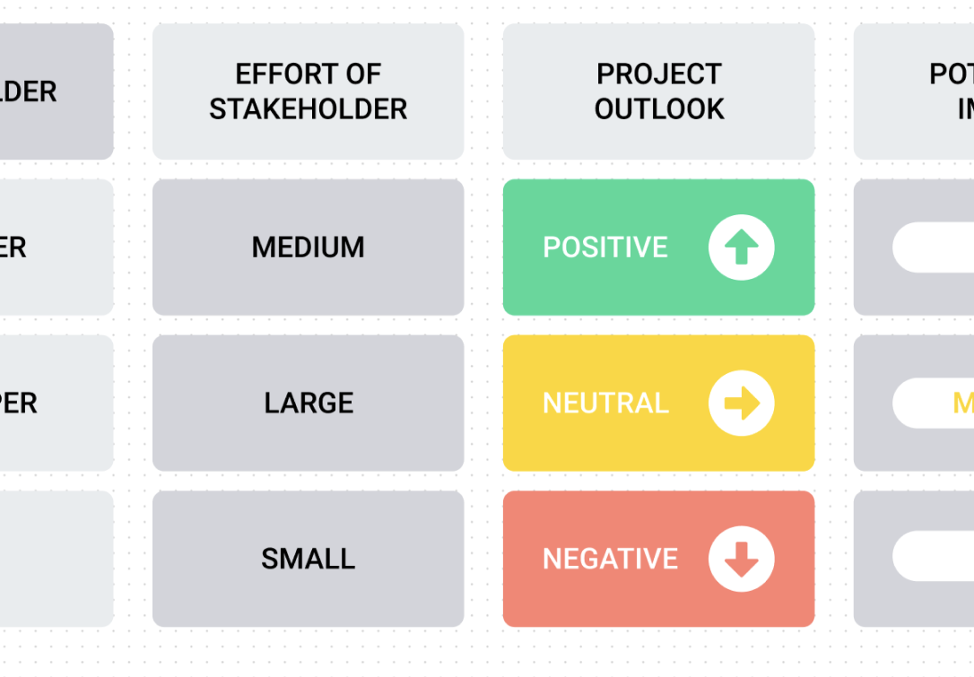
Information Architecture
The insights gathered from both Card Sorting and DoGo Mapping were synthesized to create a refined and user-centric information architecture. The end result of this process was a redesigned information architecture that aligned with users' mental models and task flows, creating an environment where features were logically grouped, and navigation was intuitive.
Wireframes + Prototypes
At the end of each sprint, we presented the developed wireframes or interactive prototypes to stakeholders, including representatives from marketing, development, and end-users. This regular cadence of feedback sessions ensured that any issues or concerns were identified early in the process, minimizing the risk of major design decisions being made without alignment.
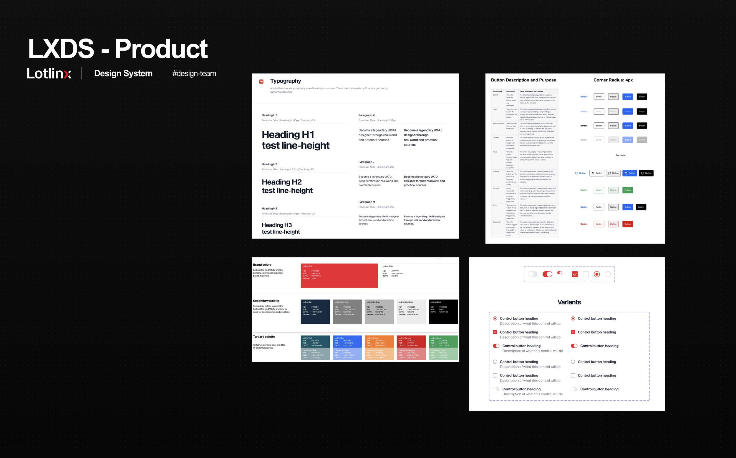
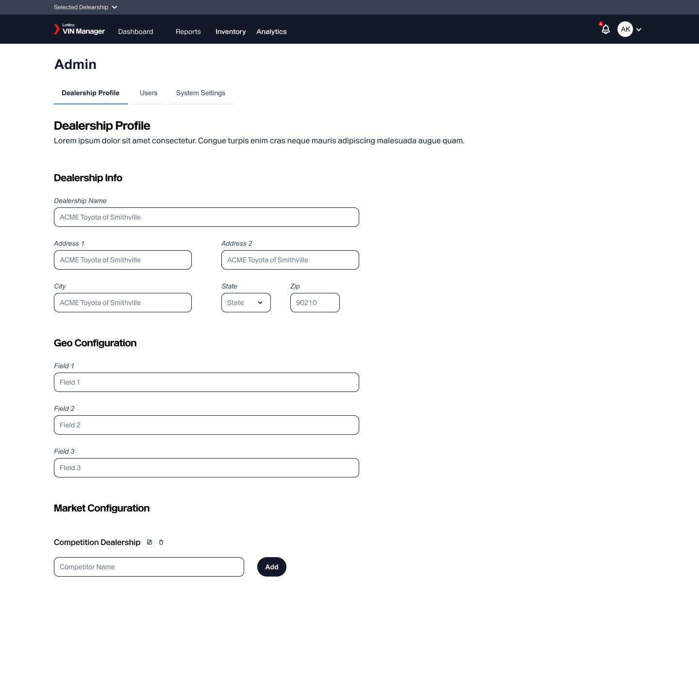
Design System
Aligned with the marketing team's new brand guidelines, and spearheaded the development of a componentized design system, ensuring consistency throughout the application. This design system, nurtured through a series of iterative design explorations and workshops, harmonized typography, color schemes, imagery styles, and more, creating balance between the brand's essence and user-centric functionality.
Feedback + Iterations
I presented design concepts to stakeholders, incorporating their feedback into the evolving design. I led the team in conducting usability testing with a select group of users to validate design choices and identify any remaining usability issues. Additionally, I collaborated closely with the engineering team to ensure the feasibility of design implementation.
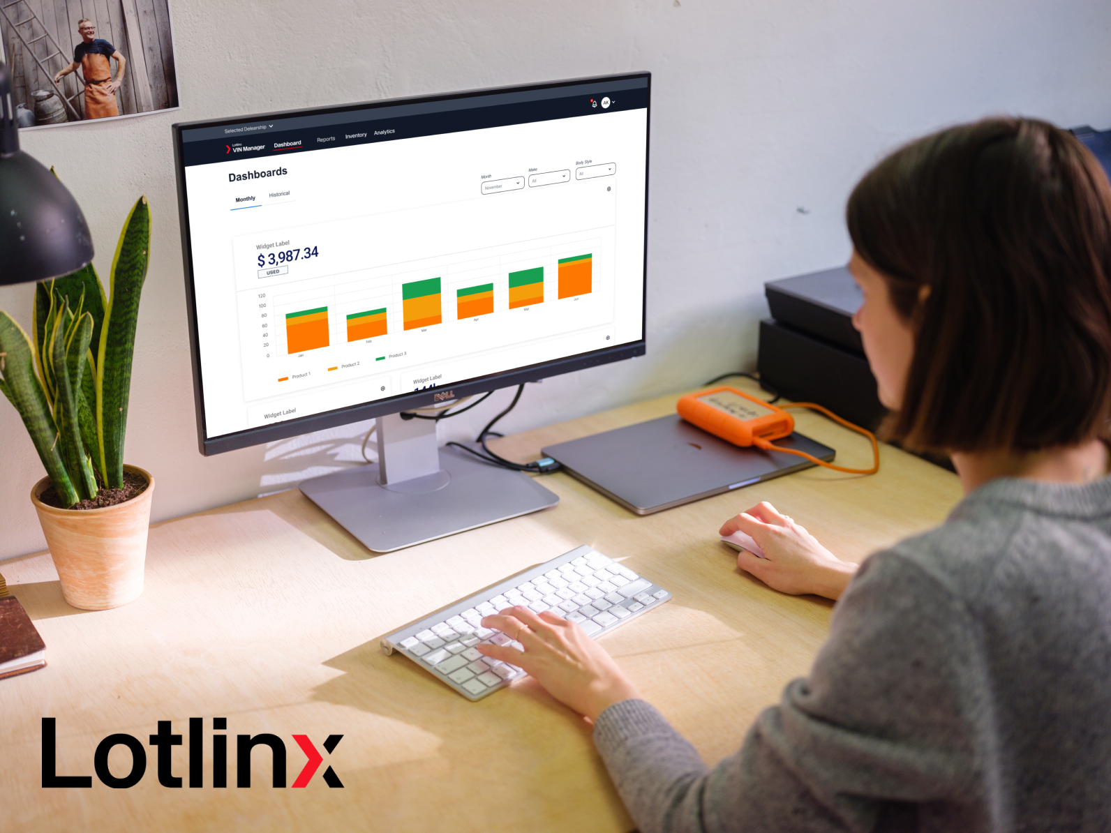
Final Design
I provided a comprehensive design package that encompassed high-fidelity mockups, interactive prototypes, and detailed design specifications. Collaborating closely with the engineering team throughout the implementation phase, I ensured swift resolution of any design-related inquiries, maintaining a seamless transition from design to development.

Reflections
The Lotlinx redesign project was a rewarding journey that challenged us to balance user needs, business requirements, and technical constraints. Through a thorough analysis of the existing application, thoughtful design exploration, and close collaboration with stakeholders, we successfully transformed the platform into a modern, user-centered solution. The positive user feedback, decreased support requests, and improved engagement metrics demonstrated the effectiveness of the redesign. This experience reinforced the importance of continuous user research and iterative design in creating impactful solutions.
Future Considerations
Color System for Data Visualization
In the future, an intriguing avenue to explore is the creation of a specialized color system tailored for data visualization. By developing a range of colors with varying intensities, gradients, and palettes, we can enhance the platform's ability to convey complex data insights effectively. This could involve assigning colors to different data categories, establishing conventions for representing trends, and ensuring accessibility compliance to make sure that visually impaired users can also derive value from the visualizations.
Conversational UI
Considering the evolving landscape of user interactions, delving into the realm of Conversational UI could be an exciting direction. Integrating chatbots or voice assistants could empower users to interact with the platform using natural language, enabling seamless data retrieval and analysis through conversations. Exploring this avenue would require designing intuitive conversational flows, ensuring accuracy in understanding user intents, and providing contextually relevant responses to enhance the overall user experience.
Researching and Creating a Service Blueprint
For a more comprehensive understanding of the customer journey, a future consideration involves crafting a service blueprint. This blueprint would provide a visual representation of Lotlinx's processes, highlighting touchpoints between the company and its customers at various stages. This holistic view would help identify pain points, opportunities for improvement, and areas where technology and design could align to enhance customer satisfaction. Such insights could lead to refined user experiences and streamlined processes, ultimately benefiting both customers and the business.